Slow Snail, Fast Coffee
We created a new coffee brand from scratch, a racing snail mascot, three roasts and packaging that carries the joke from the bag to the mug.
Completed
June 2025
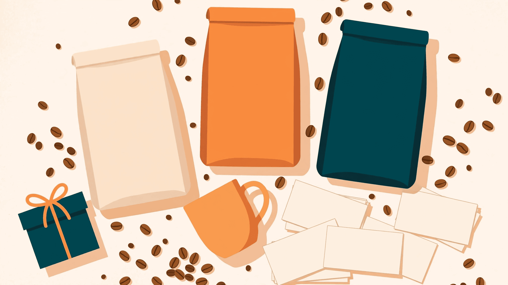
A coffee company launching a new brand asked us to create its identity, including the packaging. We built the identity from scratch: a snail mascot that races, three roasts with their own characters, and packaging that carries the joke from the bag to the mug.
Client: A coffee company launching a new brand, name withheld
Work: Brand identity and packaging design
Deliverables: Logo, mascot, three roast designs, cold brew can, gift box, mug, cards
Tagline: Good beans, brighter days
The Challenge
A new coffee brand enters a crowded market and has to be remembered after one look. The brand had to work everywhere, from a 500g bag to a mug to a business card, and it had to feel fun without feeling cheap. The packaging is the advertising: it sits on a shelf next to a hundred other bags.
A new brand has one chance to be remembered. The shopper gives it a second, maybe two, and the brand has to earn the third look. The identity had to be simple enough to read at a glance and strong enough to survive being shrunk to a business card or stretched across a gift box. It also had to feel like a coffee brand, not a joke brand: fun, but serious about the coffee.
What We Built
We built the identity around a snail that races. A slow animal, fast coffee: the joke lands in one look, and it is impossible to confuse with any other coffee brand. Three roasts each got their own version of the mascot: a dark espresso roast, a medium roast, and a light medium roast. The system runs across the bags, the cold brew can, the gift box, the mug and the cards, in warm orange and deep teal on cream. Every pack carries the brand, the mascot and the tagline.
The tagline says the promise in four words: Good beans, brighter days. It sits on every pack with the mascot, so the brand, the joke and the promise arrive together. The palette ties it all up: warm orange and deep teal on cream, the same colours on the bag, the can, the box, the mug and the cards, so the brand is recognisable wherever the coffee turns up.
The Outcome
The company has a complete identity it can use everywhere, from the shelf to the cup to the card. The brand is recognisable at a glance, and the packaging does the selling.
A new brand now has a full system, not just a logo. The company can put the brand on anything, a new roast, a new pack, a new gift set, and it will still read as the same brand. The identity does the work of a sales team on the shelf, and it does it every day the coffee is on sale.